
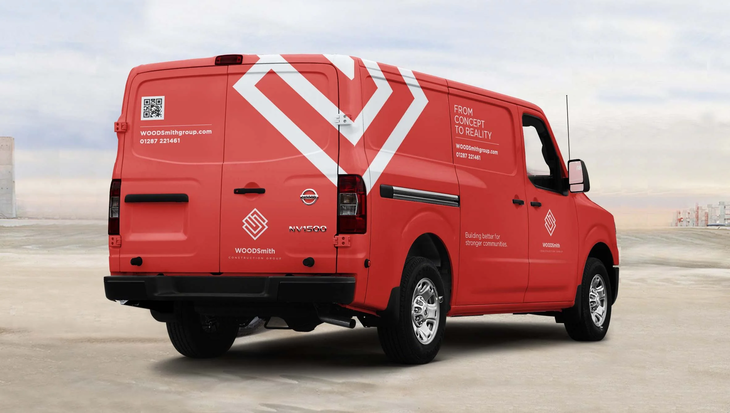
WOODSmith Construction
Brand identity for a newly formed construction business based in the northeast of England.
Logo design, out of home (OOH) hoardings and flags, van livery, safety equipment.

The interlocking, stylised letterforms of the logo reference the initials W & S from the brand name. The interplay of shapes were designed to evoke architectural structure and support, core qualities in construction, while also suggesting precision and craftsmanship, creating a distinctive, strong and ownable mark.


Cookie’s Dog Bakery
Cookies Dog Bakery, a newly founded company specialising in all-natural, low-calorie, clean dog treats, needed a fun and distinctive brand identity and packaging design to successfully launch their products to market.
